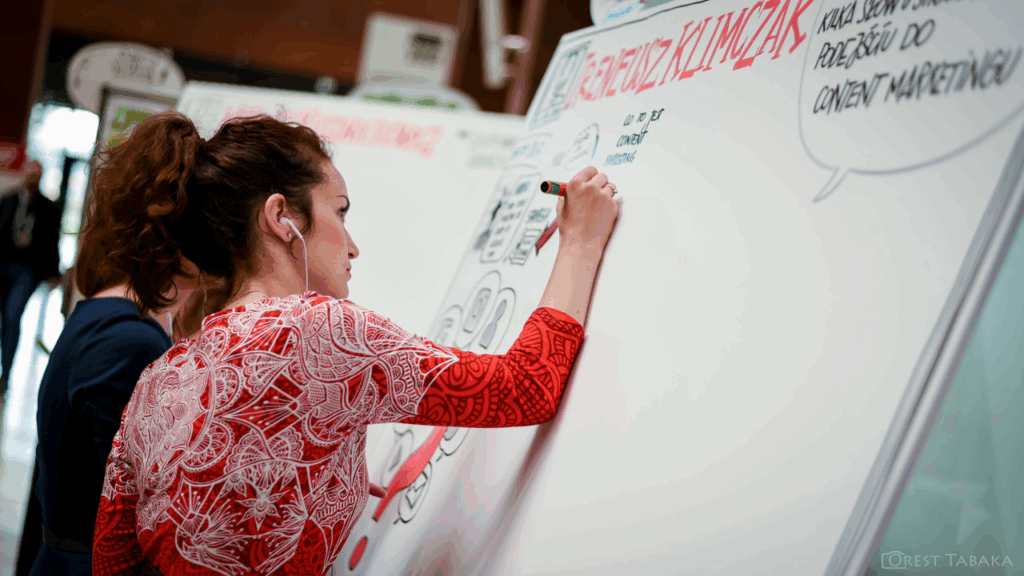
A strong graphic recording doesn’t just look good—it clarifies ideas, guides discussions, and helps people see the bigger picture. Yet, sometimes clients walk away from graphic recordings that feel cluttered or confusing, unsure of the value they received. The difference often comes down to planning and layout.
Graphic recording isn’t simply “showing up and drawing.” It requires preparation, coordination with facilitators, and intentional design choices. With thoughtful layouts, you can capture information clearly, highlight decisions, and provide context that supports participants long after the meeting ends.
Here are seven techniques to create effective graphic recording layouts and set yourself up for success.
Get Familiar with Models
Models give conversations structure and shape. Think of common tools like 2×2 matrices, Venn diagrams, or iceberg models. They appear across disciplines—from leadership and organizational development to education and business.
Graphic recorders can engage with models in three ways:
- Recreating and drawing models as they are presented.
- Transforming models to add context and meaning for the group.
- Co-creating brand new models with participants.
It’s less about memorizing shapes and more about understanding their purpose. Ask yourself whether the situation calls for a conceptual model to explore ideas, or a declarative model to represent data more directly.
Work With Containers, Differences, and Exchanges
Graphic recording is a powerful tool for systems thinking. By paying attention to containers, differences, and exchanges, you can bring order and clarity to complex discussions.
- Containers hold ideas. On the page, containers can be boxes, shapes, or sections that provide structure. Expand containers with softer shapes and color if the layout feels too tight, or contract them with sharp lines and boundaries if it needs more order.
- Differences highlight change. Use contrast—such as white space, text size, color palettes, or portrait details—to draw attention to moments of tension or turning points in the discussion.
- Exchanges show movement. Visualize how ideas, people, or information connect without overloading the page with arrows. Pathways, metaphors, and visual flows can illustrate exchanges more effectively.
Use Anchor Images
While icons are useful, relying too heavily on them can make recordings feel repetitive. Anchor images—large, central illustrations—bring clarity and impact. They balance text-heavy notes, slow down the pace for complex ideas, and provide visual cues participants can easily recognize.
Anchor images work best when they are adaptable. Sketch a few concepts ahead of time, but customize them during the session so they align with the actual conversation.
Learn Different Chart Types
Graphic recorders often need to translate raw data into visual form. Knowing the strengths and weaknesses of different chart types—such as bar graphs, pie charts, or timelines—helps you choose the right one for the moment.
Overly complex visualizations can confuse participants, while overly simple ones can miss the point. By practicing different layouts and styles, you’ll expand your toolkit and ensure the data is both accurate and understandable.
Apply Metaphors
Metaphors help participants see ideas in new ways. They can structure a page around a central theme and spark deeper engagement.
Examples include:
- Nature-based: rivers, trees, mountains, or pathways.
Mechanical: roads, gears, conveyor belts. - Social: sports, food, or shared activities.
- Abstract: arrows, circles, or diagrams.
- Cultural/place-specific: locally meaningful images such as animals, baskets, or landmarks.
While not every metaphor will resonate equally, their purpose is to support conversation and enhance understanding.
Pace Yourself With the Agenda
Every agenda presents unique challenges. Some meetings benefit from one large summary piece, while others call for multiple smaller recordings. Work with facilitators to decide where detail matters most and where broad strokes are sufficient.
Consider these pacing options:
- One summary for an entire session.
- Smaller posters for individual presentations.
- A dedicated poster highlighting final decisions.
- Multiple pieces wrapping the room with participants’ ideas.
There is no one “right” layout, but effective pacing ensures clarity and prevents fatigue—for both you and your audience.
Review and Refresh Your Practice
Improvement comes from reflection. Regularly review your past recordings to spot patterns. Do you rely too heavily on one type of shape or layout? Do certain agendas feel harder than others?
Once you notice tendencies, try small experiments—introduce new shapes, shift your composition, or change your approach to linking ideas. Over time, these adjustments will expand your versatility and elevate the clarity of your work.
Final Thoughts
Great graphic recording layouts don’t happen by accident. They require preparation, thoughtful choices, and continuous learning. By incorporating models, working with systems, using anchor images, mastering charts, applying metaphors, pacing with agendas, and reflecting on your practice, you’ll create recordings that are not only visually appealing but also effective tools for communication and decision-making.